

Visualizing the taste of coffee
2020 - Tāne Roasters Collective, Leuven
During yet another day in lockdown, I came across a blog post about Tāne Roasters Collective planning a packaging redesign. I reached out, and it quickly turned into a fun collaboration.
Maintaining the existing brand identity with a funky twist
Tāne wanted to retain their existing brand colors (vermilion and teal) and iconic logo with three typefaces, while adding a funky touch. I chose dark navy and light gray as the base, with accents of warm yellow, baby pink, and light turquoise to freshen up the palette.
Finding a sustainable container
Tāne quickly realized that no packaging is truly sustainable, but could still be eco-friendly. However, coffee presents unique packaging challenges: it releases gas, so traditional pouches need valves to prevent explosions during transit, but these valves make the packaging less eco-friendly. Additionally, the container must allow easy filling, pouring, and resealing to minimize waste and maintain freshness.
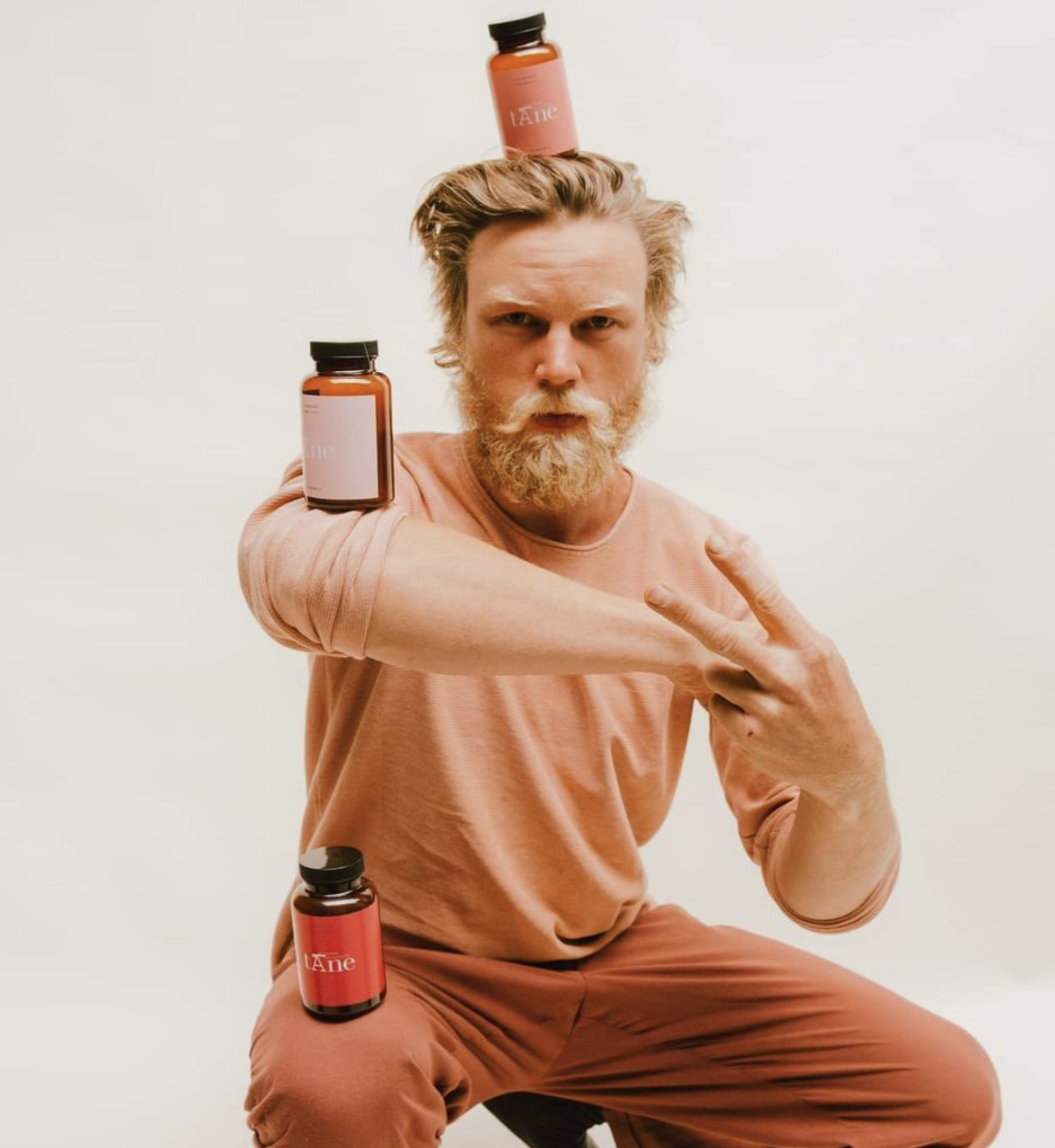
Tāne found a solution in reusable PET bottles—easy to fill, pour, and resistant to gas build-up. Customers can refill these bottles with each purchase, offering both sustainability and convenience. Resembling old medicine bottles, the PET design adds character to the packaging, with translucent options that protect coffee beans from light exposure.
Visualizing coffee’s taste
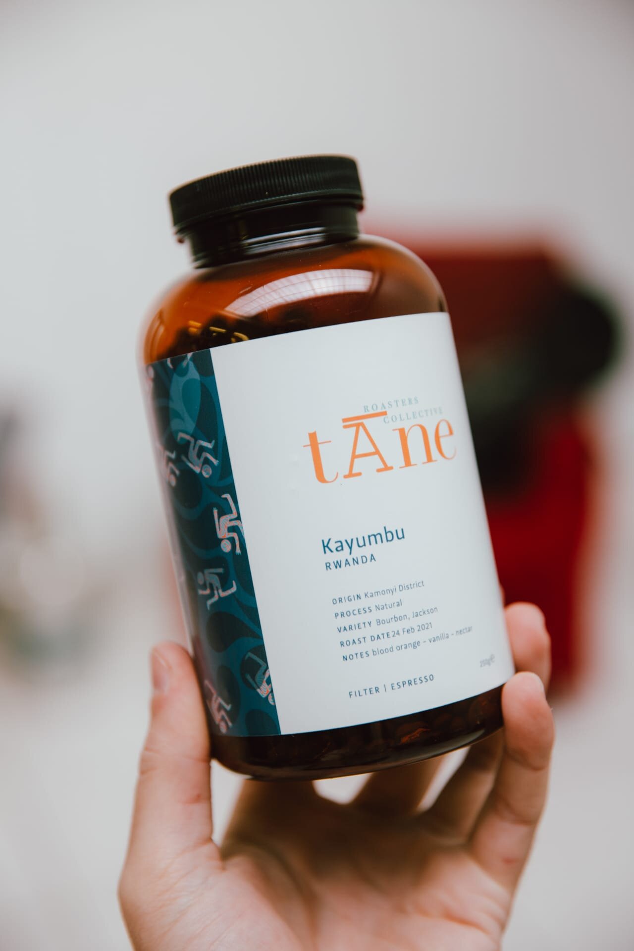
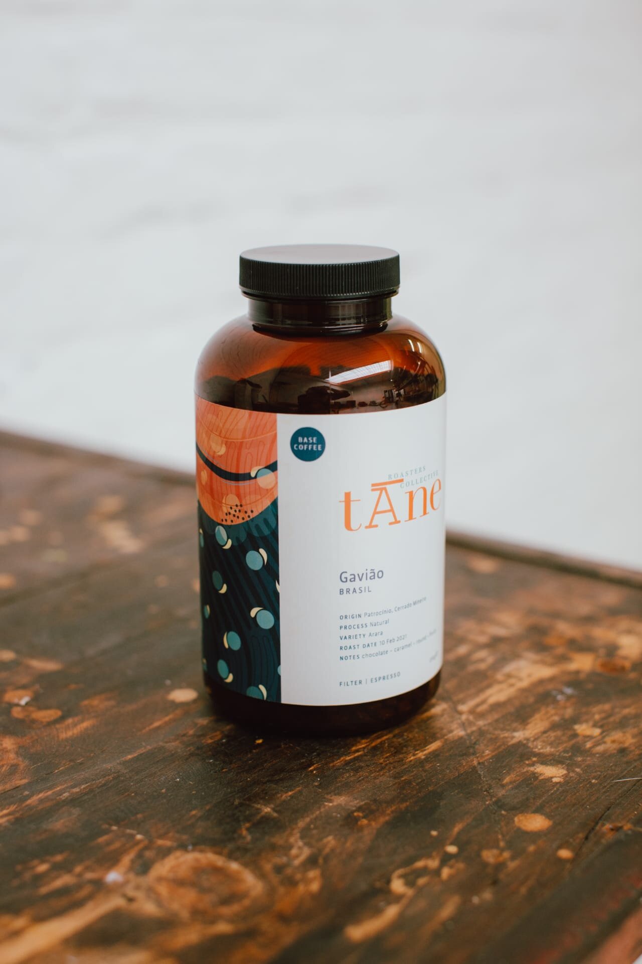
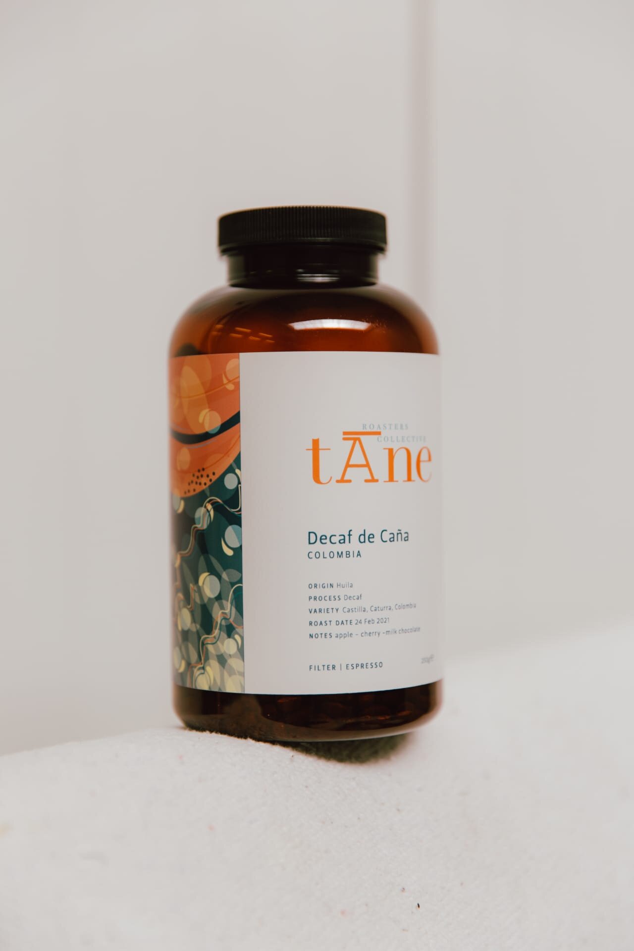
For the PET bottle label design, I drew inspiration from my own collection of coffee packaging and input from Tāne and other coffee enthusiasts. While Tāne had previously experimented with photos to represent coffee flavors, it was too labor-intensive and inconsistent. I wanted to take on the challenge of visually representing coffee's taste in a more systematic way.
Each coffee has a different taste profile, and so does its packaging. Instead of using random flavor associations, I created visuals based on a mix of structural traits (e.g., balanced, juicy) and flavor traits (e.g., bright, floral). The visuals on the packaging labels subtly describe the three most prominent tastes in each coffee—like the example below, which is balanced, rich, and chocolatey. These elements can be combined in unique ways to reflect each coffee’s distinct profile, offering a fresh, cohesive approach to taste representation.
Templating the packaging label
I created a flexible label template for the PET packers, allowing Tāne to easily update the content for each coffee. The template included dedicated spaces for details like the producer’s information, brewing recipe for filter coffee and espresso, roast date and so on. This design made it simple for Tāne to swap out the relevant information while maintaining a consistent and cohesive look across all their coffee labels.


